People are spending more time on their phones, and they use them differently than desktop computers. Even when phones are used like desktops, there are important differences-like how search engines work on mobile.
At Visibility SEO, we know that mobile optimization is just as important as optimizing for desktop search.
Mobile SEO depends on things like where the user is, the size of their screen, and the type of phone or tablet they’re using.
In this guide to mobile SEO, we’ll show you how to optimize your site for mobile devices. You’ll learn tips to boost performance and connect with more users, no matter what device they’re on. Let’s get started!
What is Mobile SEO?
Mobile SEO helps make websites work well on phones and tablets. It makes sure the right people can find your site when searching on their devices.
The main things that matter? A design that fits any screen, pages that load fast, and an easy-to-use layout. We’ll explain all of this next..

The Importance of Mobile SEO
Mobile SEO matters. It helps your website rank higher, look better, and work faster on phones. More people now use their phones to browse the internet.
If your site isn’t mobile-friendly, it’s harder to find and less enjoyable to use. Fixing this means more people can see, use, and trust your site.

Mobile traffic is more popular than desktop
In 2024, over 60% of all web traffic came from mobile devices. Mobile phones are also changing how people search online. By 2021, 63% of search engine visits were made on mobile, and this number is still growing.
To get more people to visit your website, it’s important to make sure your site works well on mobile phones. This helps it show up higher in mobile search results and brings in more visitors.

Google Uses Mobile-First Index
Google started focusing on mobile websites back in 2015. By late 2023, it switched completely to mobile-first indexing. What does that mean? It means Google looks at the mobile version of your site first when deciding how it ranks in search results.
Even if you’re browsing on a computer, the mobile site matters most. Desktop versions are still used and shown to desktop users, but your mobile site has a bigger impact on your ranking.

Customers prefer to shop from mobile devices
E-commerce and mobile devices are inseparable these days. A 2017 Google study highlighted some interesting trends:
- Searches on mobile with words like “best,” “on sale,” or “near me” shot up 250% in just two years. Crazy, right?
- Product reviews? Yep, searches for those jumped 35%!
- And here’s a big one—40% of people now prefer sticking to their phone for everything, from browsing to buying. Mobile is changing how we shop… but is it always seamless?
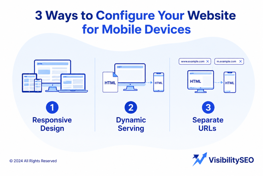
3 Ways to Configure Your Website for Mobile Devices
You have three ways to make your site work well on mobile devices.
1. Responsive Design
Responsive design means your website works on both phones and computers without needing two separate versions.
The same page is shown to everyone, but the layout changes to fit the screen size. The server sends the same HTML to every device, and CSS adjusts how it looks.
Why is responsive design good for SEO?
- It uses one URL for both mobile and desktop, so sharing and linking content is easy.
- It avoids common mobile errors.
- It’s faster and easier to manage than having separate sites.
- No redirects are needed, which speeds up load times.
- Google only needs to crawl it once, which saves resources.
Google even recommends responsive design. It helps avoid duplicate content issues.
For example, we helped a clothing store fix their site by combining their separate mobile and desktop versions into one responsive design. Their traffic jumped in just a few weeks because users and Google could navigate the site better.
Responsive layouts also adapt to any screen size, keeping your mobile content easy to read and use. It’s a smart choice for mobile SEO. Plus, you’ll save time by only needing to create one version of each page.
2. Dynamic Serving
Dynamic serving keeps the URL the same but sends different HTML to devices. Sounds clever, right? But here’s the catch: servers can mess up.
Imagine a smartphone user stuck with the desktop version of your site. Frustrating, isn’t it? That’s why Google prefers responsive design. It’s simpler, less error-prone, and delivers a smoother experience for everyone.

3. Separate URLs
Another option is to have separate URLs for your desktop and mobile websites. This means one URL for desktop, like https://www.yoursite.com/, and a different URL for mobile, like https://m.yoursite.com/.
But Google doesn’t recommend this. Why? It’s harder to manage. When someone visits your site, the server decides which version to show based on their device. Without proper setup, this can cause problems.
To avoid issues, you need special HTML tags. For mobile pages, use a rel=”canonical” tag to link to the desktop version. For desktop pages, use a rel=”alternate” tag to link to the mobile version.
If you skip these tags, Google might see both versions as duplicates. This can mess up your search rankings and hurt your SEO. It’s a complicated approach that’s best avoided.
How to Check if your Site is Optimized for Mobile
Semrush Site Audit
Semrush Site Audit tool checks your website for over 140 problems, including ones that affect mobile SEO. Once you set it up, open the “Issues” report to see a full list of errors, warnings, and notices.
Need help fixing something? Click “Why and how to fix it” for step-by-step guidance. You can also click the blue links to see which pages have the problem.

Many of these issues affect SEO on all devices, but you can search for “mobile” to find mobile-specific problems like AMP or viewport meta tags. After fixing things, run the audit again to make sure everything is solved.
PageSpeed Insights
Did you know Google ranks websites based on page experience? And yep, page speed is a big deal. Ideally, your mobile site should load in under a second. Google’s PageSpeed Insights can help.

It checks your Core Web Vitals, which measure key parts of user experience:
- LCP: How quickly main content loads.
- FID: How fast your site reacts to a user’s first click.
- CLS: How much stuff shifts around as the page loads.
Run your URL and see where you can improve.
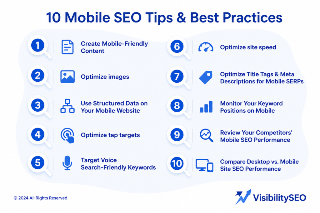
10 Mobile SEO Tips & Best Practices
Here are ten important tips and best practices for mobile SEO:
1. Create Mobile-Friendly Content
Mobile-friendly SEO content writing is easy to read and use on small screens. Here’s how to make sure your content works on mobile:
- Keep paragraphs short: Break text into small chunks that are simple to scan.
- Use headers and subheaders: Organize your content so it’s easy to find key information.
- Add bullet points: Lists make ideas clear and quick to read.
- Pick readable fonts: Use a font size that’s easy to see on phones and avoid fancy, hard-to-read styles.
- Make buttons easy to tap: Keep enough space between buttons to prevent accidental clicks.

2. Optimize images
Images can make or break how people feel about your website, right? But if they’re not optimized for mobile, users on smaller screens are going to have a bad time. Smaller images mean faster loading and less storage stress.
Try these sizes:
- Hero images: 800×1200 pixels
- Banner images: 320×480, 300×250, or 320×50 pixels
- Body images: 640×320 pixels
Too large? Resize or cut them down. For formats, PNGs are great for logos or transparent visuals, while JPGs are best for colorful photos.

3. Use Structured Data on Your Mobile Website
Improving your mobile site’s performance isn’t always easy, right? But have you tried structured data? It’s like giving search engines a map to better understand your content. Sure, it takes some effort, but the payoff? Better visibility.
Think rich snippets and search results that actually stand out. Plus, it’s a smart move to draw more traffic your way. Structured data might not seem flashy, but it’s a simple step that can make a big impact.
4. Optimize tap targets
Tap targets are the parts of a webpage you click or tap, like buttons, links, and form boxes. They should be easy to use, especially on mobile websites where most people shop.
To make them user-friendly, tap targets should be at least 48×48 pixels—about the size of your fingertip. If they’re too small, add extra space around them to hit the right size. Also, keep other elements from overlapping or blocking them. This makes websites easier and less frustrating to use.

5. Target Voice Search-Friendly Keywords
Voice search is becoming a big part of SEO. About 27% of smartphone users use voice search often. This number is even higher for younger people—65% use voice-enabled devices regularly. Tools like Siri and Alexa make it easy to search while driving or multitasking.
To show up in voice searches, your site needs to be optimized for conversational searches. For example, instead of “Adidas Sambas,” someone might ask, “Where can I buy Adidas Sambas near me?”
Here’s how to adapt: Write in a natural, conversational way. Use questions as headings and answer them clearly.
Add long-tail keywords to your text. These are longer, more specific phrases people might say out loud. You can find them using tools like Google autocomplete or People Also Ask.

Before using a keyword, check if it’s popular and not too competitive. Simple changes like these can help your site rank better in voice search.
6. Optimize site speed
Desktop site speed matters, but mobile speed is even more important. Here’s why: Google found that if a page takes 1 to 3 seconds to load, the chance of people leaving goes up by 32%. At 5 seconds, 90% leave. At 10 seconds, it’s 123%. That’s a lot of lost mobile visitors.
Many websites have slow mobile pages, but fixing it isn’t as hard as it seems. Start by compressing and optimizing images so they load faster. Cut down redirects—they cause delays. Enable browser caching so returning users don’t have to reload everything.
Minify CSS, JavaScript, and HTML to clean up unnecessary code. And use a content delivery network (CDN) to speed up how content reaches users.
At Visibility SEO, we help clients tackle slow mobile pages all the time. Once, we worked with a local bakery whose site took 8 seconds to load.
After optimizing their images and enabling caching, we cut it down to 2 seconds. Their mobile traffic jumped by 40%. It’s simple changes like these that make a big difference.

7. Optimize Title Tags & Meta Descriptions for Mobile SERPs
Metadata, like title tags and meta descriptions, is important for SEO. It tells search engines what a page is about and gives users a quick preview of the content.
Since mobile screens are small, metadata needs to be short and clear. Meta descriptions should grab attention, make people want to click and fit within the character limit so nothing gets cut off.
Experts suggest keeping titles between 50-70 characters and descriptions under 160 characters.
Good metadata is unique for every page. It highlights key points and encourages people to click. Simple, clear, and to the point—it makes a big difference.
8. Monitor Your Keyword Positions on Mobile
Ever wonder if your mobile SEO efforts are actually paying off? Tracking keyword rankings on mobile is a simple way to find out. Sure, it’s not perfect, but it gives you a clear picture of where your site stands.
Is your content showing up where it should? If not, tweak it. Refine your strategy. Because staying competitive isn’t just about showing up, it’s about showing up where it matters.

9. Review Your Competitors’ Mobile SEO Performance
To nail mobile SEO, take a closer look at your competitors. Are their keywords dominating? Is their site faster or smoother? Maybe their mobile experience just… works.
Spotting their strengths (and gaps) can spark ideas for your own strategy. It’s not about copying—it’s about learning and tweaking. Keep an eye on them. Who knows? Their next move might just inspire your next big improvement.

10. Compare Desktop vs. Mobile SEO Performance
Have you looked at how your site performs on mobile vs. desktop? It’s something many overlook. Is your mobile site loading quickly? Easy to navigate? If not, it might be time to dig in.
Fixing those little gaps (speed, responsiveness, overall experience) can make a big difference. Mobile SEO isn’t optional anymore. It’s how you stay relevant, competitive, and keep users coming back.
Get Professional Help Creating a Mobile-Friendly Site
We design and build mobile-friendly websites that are easy to use and look great on any device.
Our team makes sure your site is fast, responsive, and works perfectly on phones and tablets. We also fix technical issues and follow all the important rules to keep your site running smoothly.
At Visibility SEO, we focus on creating mobile sites that help your business show up online and stand out. Let’s work together to get your site noticed!
FAQs
What is mobile SEO?
As mobile use increases, it’s important to tailor content to the unique needs of mobile users so content is discoverable by search engines. Mobile SEO refers to the effort of doing search engine optimization (SEO) for the mobile medium, through assets such as mobile web pages or even native mobile apps.
Why is mobile SEO different from traditional SEO?
Unlike desktop, mobile search engine optimization (SEO) is impacted by the location of the user, the size of their screen, the device’s operating system, and more. Understanding these differences makes it possible to improve your rankings across devices and grow your business.
How to do SEO for mobile apps?
✅ Optimize your app’s landing page with SEO-friendly H1, meta title, and description.
✅ Implement structured data (App Schema) for Google indexing. Improve page speed (aim for sub-3-second load times).
✅ Build high-quality backlinks to boost domain authority.
Why is mobile SEO important?
A mobile-friendly site is essential because of mobile-first indexing. Google primarily uses the mobile version of your content for indexing and ranking. If your site doesn’t load quickly or adapt well to small screens, you will lose search visibility, incur higher bounce rates, and harm your search rankings.
What is a good website loading speed?
A good website loads in less than 3 seconds. If it’s too slow, people get annoyed and leave quickly. This can hurt your website. Use tools like Google PageSpeed Insights to check how fast your site is and fix any issues. Keep it quick, keep users happy!
Is a static website good for mobile SEO?
Static sites are great for mobile SEO because their content doesn’t change. Search engines can quickly figure out what’s on the page. Their structure is simple, which makes it easy to crawl and index. This helps them rank better and load faster.
Is mobile SEO different?
Mobile SEO isn’t the same as desktop SEO. Things like where the user is, the size of their screen, and what kind of phone they’re using all play a role.
Understanding these differences can help your website show up higher in search results. This means more people can find your site, no matter what device they’re using.